
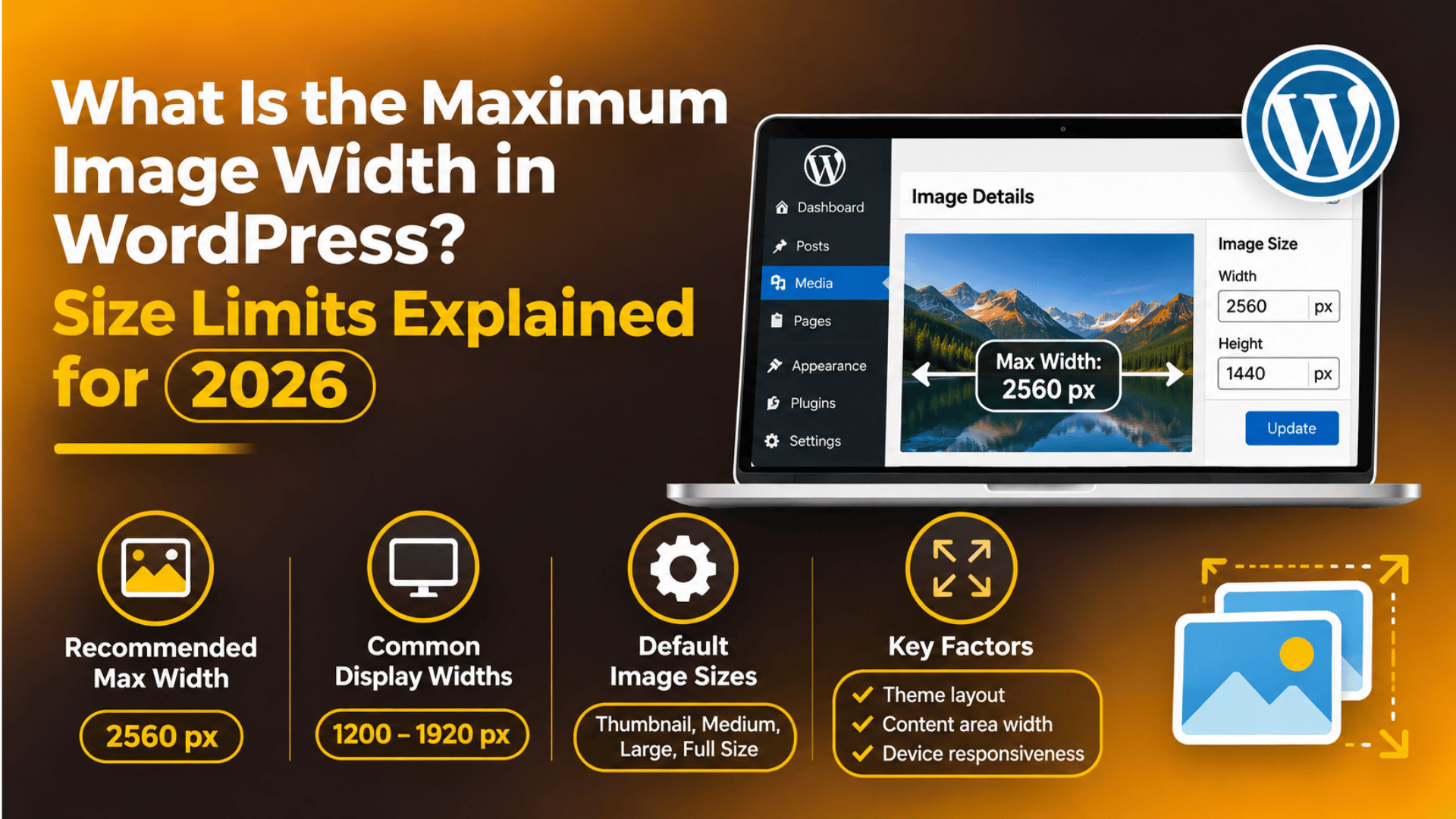
What Is the Maximum Image Width in WordPress? Size Limits Explained for 2026
Introduction
The Short Answer: WordPress Has Several Width Limits
There is no single maximum image width in WordPress. Instead, several separate limits apply at different stages. One limit decides what happens when you upload a file. Another decides which copies WordPress makes. A third comes from your theme, which controls how wide an image can look on the page.
Here is the practical summary for 2026. WordPress will accept very wide images, but it scales any image wider or taller than 2,560 pixels down to that size. It then builds smaller copies at set widths, such as 300, 768, 1024, 1536 and 2048 pixels. Your theme then shows the image inside a content area that is often only 600 to 1,200 pixels wide.
This matters because many site owners upload huge photos straight from a camera or phone. The files are heavy, pages load slowly, and the result looks no better on screen. Understanding each limit helps you pick one sensible width and stick with it. The sections below explain every limit in plain words and show where to change each one.
The Default Image Sizes WordPress Creates
Each time you upload an image, WordPress makes several smaller copies. These copies are called image sizes. They let the browser load a small file on a phone and a larger file on a desktop screen. The original file stays in your Media Library too.
WordPress makes these sizes by default. The thumbnail is 150 by 150 pixels and is cropped to a square. The medium size is up to 300 pixels wide and 300 pixels tall. The medium large size is 768 pixels wide with no height limit. The large size is up to 1024 pixels wide and 1024 pixels tall. Two more sizes, 1536 and 2048 pixels, are added for sharper screens.
You can change the thumbnail, medium and large values yourself. Go to Settings, then Media in your WordPress dashboard. Type new maximum widths and heights, and save the page. The change only affects images you upload after that point. Older images keep their old copies until you regenerate them.
Note that the numbers on this screen are maximums for a box, not exact sizes. WordPress shrinks the image until it fits inside the box and keeps the shape of the original. A wide photo in a 1024 by 1024 box ends up 1024 pixels wide and shorter than that in height. A tall photo ends up 1024 pixels tall and narrower.
The 2,560-Pixel Big Image Threshold
The closest thing to a real maximum width is the big image threshold. Since WordPress 5.3, any image larger than 2,560 pixels on its longest side is scaled down on upload. WordPress keeps your original file on the server. It uses a new copy with the word “scaled” in the file name as the main image.
The aim is to protect your site. A 6,000 pixel photo can use a lot of server memory while WordPress builds smaller copies. Large files can also stall uploads or fail with a memory error. The threshold keeps those problems away without any setup from you.
Developers can change the limit with a filter called big_image_size_threshold. They can raise it, lower it, or turn it off by returning false. Most sites should leave it alone. If you need a lower limit, such as 1,920 pixels, ask a developer to add a small code snippet. Always take a full backup first, or test the change on a staging copy of your site. A typo in a theme file can take your site offline.
You can tell that the threshold was applied by looking at the file name. Open the image in the Media Library and check the file URL. If it ends with -scaled, WordPress resized it. The original sits next to it with the same name but without that ending.
How Your Theme Limits Image Width on the Page
Your theme sets the visible limit. Even if a 2,560 pixel image exists, the theme will fit it inside the content column. Many themes use a content width between 600 and 1,200 pixels. Full-width and wide blocks can stretch further, up to the width of the screen.
Block themes store these widths in a file called theme.json. It holds two values: the content size and the wide size. Content size is the normal column. Wide size is used when you set an image block to wide alignment. You can see these values in the Site Editor, under Styles, then Layout. Older classic themes use a PHP setting called content_width, which is set in the functions.php file.
When you add an image to a post, the block editor shows the image at the size of its column. You can pick a size in the block settings on the right. Choose Thumbnail, Medium, Large or Full Size. Full Size uses the biggest copy, and the theme then shrinks it with CSS to fit the column. The browser still downloads the larger file, which is why careful sizing helps speed.
If you want images to span the full screen, choose the Full Width alignment. Not every theme supports it. If the option is missing, your theme does not allow wide images, and you would need a different theme or custom CSS.
Upload Limits: File Size Is Not the Same as Width
Many people mix up two different limits. Pixel width describes how many dots wide the picture is. File size describes how many megabytes the file takes up. WordPress does not set a maximum pixel width on upload, but your server does set a maximum file size.
The file size limit comes from PHP settings called upload_max_filesize and post_max_size. Many hosts set them between 2 MB and 64 MB. You can view your current limit by going to Media, then Add New. The page shows a line that reads Maximum upload file size. If a photo is larger than that number, the upload fails with an error.
A second limit is memory. Resizing an image takes memory, and the amount needed grows fast with pixel count. A 4,000 by 6,000 pixel image holds 24 million pixels. If PHP runs out of memory while making copies, you may see a message such as “Post-processing of the image failed”. The fix is usually to resize the image before upload or ask your host to raise the memory limit.


If you hit upload errors, read our guide on how to increase the upload size in WordPress. For other failures, see our image upload error fixes.
How to Check and Change Your Image Width Settings
You can review every setting in a few minutes. Follow these steps in order. Before you begin, take a backup of your site, because the later steps change how files are stored.
Step 1: Check the size settings. Go to Settings, then Media. Read the thumbnail, medium and large values. Lower the large value to 1200 if your column is narrow. Click Save Changes.
Step 2: Check your theme width. In a block theme, open Appearance, then Editor, then Styles, then Layout. Note the content and wide sizes. In a classic theme, ask your developer what content_width is set to.
Step 3: Test one image. Upload a photo that is 3,000 pixels wide. Open it in the Media Library. Check the Dimensions line on the right. If you see 2,560 pixels wide, the threshold worked.
Step 4: Add custom sizes if you need them. Developers can register extra sizes in the theme with add_image_size. This is useful for banners or product photos that need a set shape. Our guide to custom image thumbnail sizes in WordPress shows how.
Step 5: Regenerate old images. After a size change, older images keep the old copies. A regeneration tool rebuilds them. With WP-CLI, the command is wp media regenerate. Run it only after a backup, and test on staging first when you can. The job can take a while on large libraries.
The Best Image Width to Use in 2026
For most blog posts, an image between 1,200 and 1,600 pixels wide is plenty. It looks sharp on a desktop screen and on high-density phone screens. It also stays small enough to load quickly. If your column is 800 pixels wide, a 1,600 pixel image gives you a sharp result on screens that pack in twice as many dots.
Full-width hero banners can go up to 2,000 or 2,560 pixels. Going past 2,560 gains nothing, because WordPress scales the file down anyway. Product photos for a store often work best at 1,000 to 1,500 pixels, with a square shape for tidy grids.
File type also matters. WordPress supports JPEG, PNG, GIF and WebP, and newer versions also support AVIF. WebP and AVIF give much smaller files at the same look. Use JPEG for photos and PNG only when you need sharp edges or clear backgrounds. Aim for under 200 KB per image where you can.
WordPress also builds a srcset list for each image. This is a list of sizes that lets the browser choose the best copy for the screen. It works best when your uploads are at least as wide as your largest column. For social shares, see our guide to social media image sizes.
Fixing Images That Look Too Small, Too Wide or Blurry
If an image looks blurry, it is usually too small for its space. The browser stretches it. Upload a larger version, at least as wide as the column. For high-density screens, double the column width.
If an image looks too small, check the size you picked in the block settings. You may have chosen Medium when you wanted Large. Also check whether your theme caps width with CSS. Right-click the image, choose Inspect, and look for a max-width rule.
If an image spills out of the column, the theme may lack responsive CSS. A simple rule, max-width of 100 percent with height auto, usually fixes it. Add it in Appearance, then Customize, then Additional CSS, so that a theme update does not erase it.
If new images do not match the sizes you set, remember that changes apply only to new uploads. Regenerate the old ones. Clear any cache plugin or server cache afterward, or visitors may keep seeing old files. If you are unsure about any step, you can review how featured images and thumbnails work before you change anything.
Conclusion: Pick One Width and Keep It Simple
Image sizing touches your theme, your media settings and your server. A small mistake can slow a site or break a layout. If you would like someone to look at your setup, the team at 24×7 WP Support works on WordPress performance, media settings and theme layouts every day.
A simple routine keeps things tidy. Resize photos to about 1,600 pixels before you upload them. Keep the Settings, then Media values close to your real column width. Check one new image after each theme change, and clear your cache so visitors see the latest files. Small habits like these keep pages fast and images sharp without extra tools.
To sum up, WordPress has no single width cap. It scales images above 2,560 pixels, makes smaller copies at set widths, and shows them inside the width your theme allows. Pick one working width, resize photos before upload, and keep a backup before you change any setting.
Related posts:

WordPress Website Monitoring Tools and Services (Free and Paid)

WooCommerce Google Docs integration: #1 Sales Funnel Builder

What Is CiviCRM for WordPress and How Does It Work?

Validation Error- PayPal IPN Response From A Different Email Address In WordPress

Essential Technical Optimisation Best Practices for WordPress Business Sites

Brian is a WordPress support specialist and content contributor at 24×7 WP Support. He writes practical, easy-to-follow guides on WordPress troubleshooting, WooCommerce issues, plugin and theme errors, website security, migrations, performance optimization, and integrations. With a focus on solving real website problems, Brian helps business owners, bloggers, and online store managers keep their WordPress sites running smoothly.