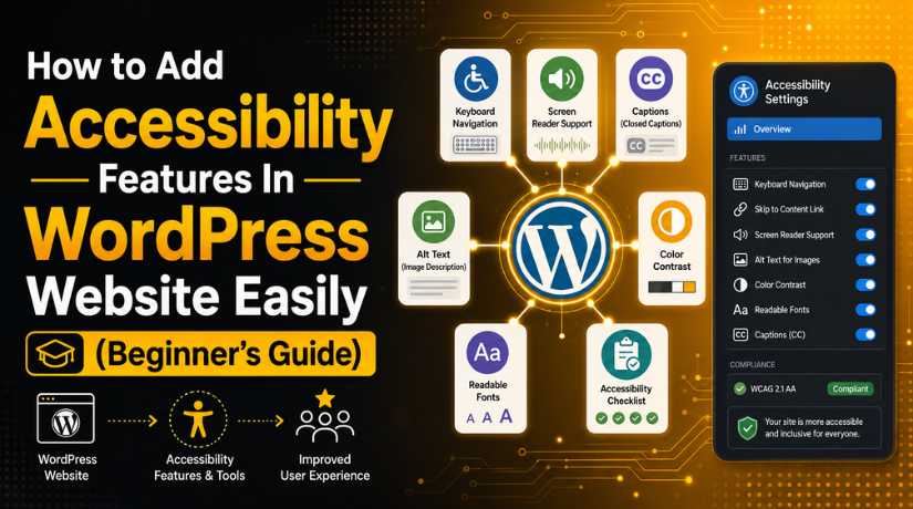
How to Add Accessibility Features In WordPress Website Easily (Beginner’s Guide)
Introduction
A WordPress website should work well for every visitor. Some users read content on small mobile screens. Some users browse with keyboards instead of a mouse. Some users depend on screen readers to understand website content. This is why WordPress accessibility is very important today. It helps every visitor use your website with ease, comfort, and confidence.
Website accessibility means removing barriers from your website. These barriers can stop users from reading, clicking, buying, or contacting you. A website may look beautiful, but still be hard to use. Small text, weak colors, missing labels, and broken menus can create problems. These issues can hurt user experience and business results.
Many website owners think accessibility is only for large brands. That is not correct. Every small business, blog, store, and service website needs accessibility. A user-friendly website should welcome every visitor. It should also help people complete important actions without confusion.
What Are Accessibility Features in WordPress?
Accessibility features in WordPress are improvements that make your website easier for everyone to use. These features help visitors read content, browse pages, click buttons, submit forms, and understand your website without barriers. They are useful for people using screen readers, keyboards, mobile devices, voice tools, or other support tools.
They also help users who may have low vision, hearing issues, or temporary problems while browsing. WordPress accessibility is not only about adding one tool or plugin. It includes your theme, design, content, images, forms, menus, buttons, colors, and page layout. A WordPress accessibility plugin can help scan issues. It may also add some support features. But it cannot fully fix poor design, weak coding, or unclear content.
What Are the Benefits Of Using Accessibility Features in WordPress?
Better User Experience for Every Visitor on Your WordPress Website
Good WordPress accessibility improves the full user experience. Visitors can read content with less effort. They can find pages without confusion. They can also click buttons and submit forms easily. A clean layout helps users stay focused on your message.
More People Can Use Your Website Without Facing Barriers
Website accessibility helps more people use your website properly. Some visitors may have low vision. Some may use screen readers. Some may browse only with a keyboard. Others may need captions, clear labels, or simple layouts. Good accessibility removes these common barriers.
Improved Website Trust and Stronger Brand Image
A website should feel easy, safe, and professional. Good accessibility in WordPress helps build that feeling. Visitors trust websites that are simple to use. They also trust websites that show clear information. If buttons, menus, and forms work well, users feel confident.
Better Form and Checkout Completion for Leads and Sales
Forms are important for most WordPress websites. Contact forms bring leads. Signup forms build email lists. Checkout forms complete online sales. Poor form design can stop users from submitting details. Accessible forms use clear labels and helpful messages.
Stronger SEO Support Through Clear Website Structure
Accessibility can also support SEO in a natural way. Clear headings help users and search engines understand content. Image alt text explains important visuals better. Readable content keeps visitors engaged for longer. Simple navigation helps users move through your website.
Reduced Website Barriers and Better Mobile Experience
WordPress accessibility features reduce common website problems. They fix unclear links, weak colors, small buttons, and poor menus. These changes also improve mobile experience. Mobile users need readable text and easy tap areas. They also need simple forms and clear navigation.
Precautions Before Adding Accessibility Features In WordPress
Backup Your WordPress Website Before Making Accessibility Changes
Always create a full backup before changing your website. Accessibility updates may affect themes, plugins, forms, and layouts. A backup protects your website from unexpected problems. You can restore the site if something breaks. Take a backup of files and the database.
Do Not Depend Only on Accessibility Overlay Plugins
Many website owners install one WordPress accessibility plugin and stop there. This is not the right approach. A plugin can help find and fix some issues. But it cannot solve every accessibility problem. Poor headings, weak forms, and broken menus need manual checks.
Check Theme Compatibility Before Adding New Features
Your WordPress theme controls many important website parts. It manages menus, buttons, headers, footers, and page layouts. A poor theme can create serious accessibility issues. Check if your theme supports keyboard navigation properly. Make sure focus indicators are visible and clear.
Review Page Builder Elements Before Publishing Changes
Page builders make website design easy for many users. But some elements can create website accessibility problems. Sliders, popups, tabs, accordions, and animations need careful testing. These sections should work with keyboard controls. Users should also close popups without using a mouse.
Test Forms Before and After Accessibility Updates
Forms need special care during accessibility work. Contact forms, signup forms, and checkout forms must stay usable. Every form field should have a clear label. Required fields should be easy to understand. Error messages should explain the exact problem clearly.

Avoid Design Changes Without Testing Color Contrast
Color changes can improve design, but they can also harm readability. Always test text and background contrast before publishing. Light text on a light background is hard to read. Small buttons with weak colors can confuse users. Do not use color alone to show important messages.
Check Plugin Updates and Conflicts Carefully
Plugins can improve accessibility, but they can also cause issues. Use trusted plugins that receive regular updates. Avoid installing too many accessibility tools together. Multiple plugins may conflict with your theme or builder. They can also affect speed and layout quality.
How to Add Accessibility Features to a WordPress Website (Step By Step)
Adding accessibility features is simple when you follow small steps. These steps help every visitor use your website easily. Better WordPress accessibility also improves trust and user experience.
Step 1: Check Your Website First
- Open your website like a normal visitor.
- Check your menu, buttons, forms, images, and content.
- See if anything is hard to read or click.
- Check your website on mobile and desktop.
- Note every issue you find during checking.
- This helps you find basic website accessibility problems.
Step 2: Use a Simple Accessibility Plugin
- Install a trusted WordPress accessibility plugin.
- Use it to scan your website pages.
- Check missing alt text, headings, and color issues.
- Review all plugin suggestions carefully.
- Do not depend only on the plugin.
- A plugin helps, but cannot fix everything.
Step 3: Add Clear Alt Text to Images
- Open your WordPress Media Library.
- Check all important images on your website.
- Add short and clear alt text.
- Describe what the image shows or explains.
- Avoid random text like “image one.”
- This improves useful WordPress accessibility features.
Step 4: Use Clear Headings on Every Page
- Use one main H1 heading on each page.
- Use H2 headings for main sections.
- Use H3 headings for smaller points.
- Keep the heading order simple and clear.
- Do not use headings only for large text.
- Good headings improve accessibility in WordPress.
Step 5: Make Text Easy to Read
- Use simple fonts across your website.
- Keep font size easy to read.
- Write short and clear paragraphs.
- Add enough space between lines.
- Avoid difficult words where possible.
- Easy text helps users read content faster.
Step 6: Improve Color Contrast
- Check text and background color carefully.
- Avoid light gray text on white backgrounds.
- Use clear button colors.
- Make links easy to see.
- Do not show errors using color only.
- Good contrast supports better website accessibility.
Step 7: Make Menus and Buttons Easy to Use
- Test your website using the Tab key.
- Check if menus are easy to reach.
- Make sure buttons can be selected.
- Check dropdown menus with keyboard controls.
- Keep focus outlines visible and clear.
- This supports an ADA compliant WordPress website.
Step 8: Make Forms Simple and Clear
- Add clear labels for every form field.
- Do not use only placeholder text.
- Mark required fields clearly.
- Show simple error messages.
- Tell users how to fix each mistake.
- Test contact forms and checkout forms properly.
Step 9: Add Captions to Videos
- Add captions to important website videos.
- Use simple captions that match the audio.
- Add transcripts for audio content when possible.
- Avoid autoplay video or sound.
- Let users pause or stop moving content.
- This helps more users understand your media.
Step 10: Test Your Website After Changes
- Test your website after every major change.
- Check your homepage and service pages.
- Review blog pages and contact pages.
- Test forms, menus, buttons, and links.
- Check cart and checkout pages for WooCommerce.
- Regular testing keeps WordPress accessibility strong.
Common WordPress Accessibility Mistakes to Avoid on Your Website
Many website owners want better WordPress accessibility, but miss simple issues. These small mistakes can create big problems for users. A website may look modern, but still feel hard to use. That is why you should check common accessibility errors often. These checks help improve user experience, trust, and website quality.
Missing Alt Text on Important Website Images
Missing alt text is a common accessibility mistake. Screen readers cannot explain images without helpful text. Important service images, product images, and banners need clear descriptions. Alt text should explain the image purpose in simple words. Do not use random file names like image123.jpg.
Poor Color Contrast That Makes Text Hard to Read
Weak color contrast can make your content difficult to read. Light gray text on white backgrounds creates common problems. Small text with weak colors can confuse many users. Buttons should also have clear text and strong contrast. Users should understand every button without extra effort.
Using Headings Only for Design Instead of Structure
Many websites use headings only to make text bigger. This creates a poor content structure for screen readers. Your page should have one clear H1 heading. Main sections should use H2 headings in proper order. Smaller subpoints can use H3 headings when required.
Vague Button and Link Text That Confuses Users
Buttons and links should clearly explain their action. Text like “click here” or “read more” is unclear. Users may not understand where the link will take them. Use direct text like “View WordPress Support Plans” instead. Clear labels help screen readers explain links better.
Menus That Do Not Work With Keyboard Navigation
Some visitors use only a keyboard to browse websites. If menus need a mouse, those users face barriers. Dropdown menus should open through keyboard controls. Links, buttons, forms, and popups should also be reachable. A visible focus outline should show the active item.
Forms Without Labels and Clear Error Messages
Forms are important for leads, bookings, and sales. But many forms depend only on placeholder text. Placeholder text disappears when users start typing details. Every form field should have a clear label. Error messages should also be simple and helpful. They should explain what went wrong and how to fix it.
Auto-Playing Videos, Sliders, and Hard-to-Close Popups
Auto-playing videos and sliders can distract many visitors. Some users may need time to read content. Moving content should include pause or stop controls. Popups should also have clear close buttons. They must work with keyboard controls as well. A popup should never trap users on the page.
Ignoring WooCommerce Checkout Accessibility
WooCommerce checkout pages need special accessibility checks. Customers must complete payment without confusion or blocked steps. Shipping fields, payment fields, and coupon boxes need labels. Error messages should show clear next steps. Login options should also be easy to find.
Conclusion
Adding accessibility features to a WordPress website is not only a design improvement. It is a better way to serve every visitor. A clear layout, readable text, proper headings, helpful alt text, keyboard-friendly menus, and accessible forms can improve the full user experience. These changes also make your website easier to browse, understand, and use on every device. A WordPress accessibility plugin can help you find some issues, but it should not be your only solution.
Real WordPress accessibility needs proper testing, careful setup, and regular maintenance. You should also review your website after theme updates, plugin updates, design changes, and new content uploads. If your website is hard to use, visitors may leave before taking action. But when your website is accessible, users can read, click, contact, and buy with more confidence.
If you want expert help improving accessibility, usability, speed, or technical performance,24x7wpsupportcan help. Our team can review your WordPress website, find key issues, and fix problems that affect users. We can check your theme, plugins, forms, navigation, content structure, mobile layout, and overall website performance. Visit 24x7wpsupport today and get professional WordPress support for a better, safer, and more user-friendly website.

Brian is a WordPress support specialist and content contributor at 24×7 WP Support. He writes practical, easy-to-follow guides on WordPress troubleshooting, WooCommerce issues, plugin and theme errors, website security, migrations, performance optimization, and integrations. With a focus on solving real website problems, Brian helps business owners, bloggers, and online store managers keep their WordPress sites running smoothly.