
Everything You’ve Ever Wanted To Know About Responsive Media Queries
Last updated on August 10th, 2021 at 01:13 pm
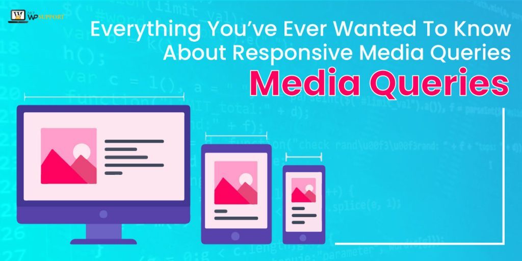
There has been a lot of change on the internet in recent years because of the launch of mobile devices, do you feel so? This small change has made big alterations in every industry. In recent times, your website would be visited by an array of devices such as desktop with large screens, tablets, smartphones and all sort of other electronic devices.
To make your website responsive it is paramount for you to make your website secure, fast and most importantly mobile-friendly. Responsive web designing has gained a lot of popularity in this context as it creates websites which can work across all the devices. So, let’s first gain an insight into what is responsive design and how does it work?
Responsive Design is a proposal which recommends that design and development should respond to the end user’s behaviour and environment relying on the platform, screen size and orientation. It aims at creating the websites adaptable to the devices that are being used to access them. Their main focus is on making the sites accessible comfortable for the users without the requirement of zooming, resizing or scrolling.
It comprises of a blend of pliable grids, images, layouts and wise usage of responsive media queries. With the help of responsive design as the user would switch from a laptop to mobile device, the site would automatically rearrange the image size, resolution and scripting abilities. You might have to make a few settings on the device to accommodate these settings. The major features that responsive design offers are-a
- Adjusting screen resolution
- Flexible images
- Custom Layout Structure
- Media Queries
- JavaScript
- Showing or Hiding content
How does Responsive Design work?
It works through Cascading Style Sheets, using an array of settings to serve various style properties based on the screen size, resolution, orientation, colour capability and other features of the user’s device. It works according to numerous principles, amongst them the major principle is that one should use proportionate size instead of using the absolute measures.
The benefit of it is that no matter on which device you look at the website, it would always appear the same and people using mobile phones would not have to scroll or zoom in to view the content. Responsive design has a lot of benefits using it on your website. Want to know more of them?
Advantages of Responsive Design
There are dozens of benefits using responsive design but the major advantage is that you would only require one website, offers media query for all devices, fluid grid, responsive images and media, improved user experience, increase in mobile traffic, faster website development, easier maintenance, simpler website analytics, lesser bounce rates and much more.
The best thing is that saves the hassle and enables everyone to use the same domain. Thus it works pretty well for everyone irrespective of any device or browser.
Challenges of Responsive Design
The first drawback is that the mages would have to be scaled down based on the device width and you would also have to consider the retina display. The next challenge is that older versions of devices can be big trouble for responsive design as it does not recognizes internet explorer version below version and also does not support older versions of Firefox and chrome.
This was all about responsive design, eager to know what technology works behind it.
Technology that supports Responsive Design
The core support of responsive design is CSS, this is the pillar which is majorly responsible for the styling of every website. Everything that you see on your website which makes it look good is through CSS such as colours, size of the font, styling, etc. It is because of the CSS that you would be able to use proportionate measures as it determines the object size. But if you wish to make your website look appealing and equally good on mobile devices then for that you would have to use CSS media queries.
Media Queries
Media query comprises of an optional media type and an array of optional expressions which restrict when the query triggers, like pixel-density, width or orientation. In simple language, they are the operators which allow designers and developers to add conditions for different presentation mediums. They let email developer build a highly responsive email by identifying the width of the display. In situations like this media query min and max are used.
How does Min and Max Queries Work?
Let us understand them with an example. Example of max query-
@media only screen and (max-width: 500 p) {…}
Here the max query means, if (device-width) is less than or equal to 500px, then do {…}
This means that email was opened at iPhone 6 with a screen width of 350px, the media query would automatically trigger and all the styles mentioned in {…} would come into effect.
Min media query example-
@media only screen and (min-width: 500px) {…}
Here the min query means, if (device-width) is greater than or equal to 500, then do {…}
This means that if the email was opened at iPhone 6 with a screen width of 350p, the media query would not trigger and the styles mentioned in {…} would not come into place.
Combining Media query expressions
Media query max and min-width can be combined if you wish to target on a particular range of screen sizes. Here is an example for you-
@media only screen and (max-width:700 px) and (min-width:500 px) {…}
This means that the above-mentioned query would only come into effect when the screen is 700-500px wide. Thus you can easily combine them if you wish to focus on some particular devices with known width or screen size.
By now min and max media query must have become clear, now it’s time to know other important things about media query.
Where to place media query for all devices?
The paramount thing you should know about it is that they are placed at the end of the file always. The reason behind it is that the browsers scan the stylesheets from top to the bottom. In the case of media queries, any rule that is placed at the bottom would overrule any instruction mentioned at the top.
Thus if at the top of the sheet you mention font size of 15x you can easily alter it for bigger screens by mentioning a media query at the bottom of the page.
A lot of things have become clear about media query but there are some other use cases of media queries that you should be aware of.
Media Queries in Responsive Design
1) Smart Zoom – This is a feature for mobile browsers so that they can get a premium reading experience. It is used so that the page size can be reduced, it can come into effect by 2 ways, first is user-initiated zooms and the second is displaying the zoomed-in version of the web page as soon as the page loads. This implies that you can apply responsive media queries to solve any issues at which zoom might be focused.
It is always advised to disable zoom and assure that the page content always fills the browser-
<meta name=”viewport” content=”width=device-width, initial-scale=1″ />
In this, if you set the initial scale to 1, that implies you control the initial page zoom level.
If you want you can disable the zoom by this code-
user-scalable=false.
2) Hide Content on Smaller Devices- When we specifically talk about smaller devices, it is always good to hide content instead of moving the content around. This can be done in cases where the content if it does not add much importance to mobile devices or if loading that content would make the connection really slow. You can disable that content to display on small devices easily; here is an example to understand it-
@media only screen and (max-width: 580px) {
.small image{
display: none;
}
}
3) Page Widths – If you wish to provide three different types of layouts, one for mobile devices, other for tablets and the third one for desktop. It becomes tough for you to decide which dimension to opt for as there is no set standard for the page widths to target. There are an array of dimensions that exist. For example 320 and up in that you would find 5 dimensions 480, 600, 768, 992 and 1382px. Thus, from any of the sets, you can select one according to the usage.
4)Moving the Sidebar below the content area- In responsive web design moving the content below the sidebar is the common trick. The reason behind it is that there is less space on mobile devices, particularly when the devices are in portrait mode there is no point in stuffing more things around the main content. Because of this reason, you can see a similar media query example, in modern stylesheets-
@media only screen and (max-width: 500) {
.sidebar {
float: none;
width:50%;
}
}
5) Pseudo-Elements – This might sound new to you but this feature helps you in hiding some piece of the content programmatically according to the size of the user’s device. They can be applied to particular styles to various portions of HTML element. This can be understood well with an example- the (: second line) it would help you in defining styles purely on the second line a specific selector (q: the second line would apply to the second line of q)
The good thing about pseudo-elements is that is supported by all the major browsers. If you wish to create three different types of layout for desktop, tablet and mobile devices as all of them have different requirements. For setting up the same login button for a different type of screens size you need to-


.username:after{
content:”Insert username”;
}
@media screen and (max-width: 1024px) {
.username: before {
content:”user name”;
}
}
@media screen and (max-width:480px) {
.username: before {
content: “”;
}
}
After using: before and”after pseudo-elements you would get the screen asking for your user name.
Coding with Media Query
There is a piece of good news for you is that if you use a media query to your emails, it can make them highly responsive. Therefore, you add CSS styles, you can also add media queries to it. Here is an example, in which you would see the embedded CSS in the <head> of the HTML, and there you can add media query between <style></style> tags.
First step
The primary thing you would have to do is adding class and CSS which you would want to set between the style tags. Here, the class that we would set is .200, which is same that we use on mobile for creating tables and columns stretch to the full width of the containing table.
<style>
.200pc {
Width: 100%
}
</style>
Second Step
In this step, you would have to add a media query around the class. Here, we would take the max screen size of 720px.
<style>
@media screen and (max-device-width : 720 px), screen and (max-width :720 px) {
.100pc {
Width : 100%
}
}
</style>
Third Step
Here we would add ! important, as some email clients need inline styles, for that you would have to add ! important, after the style to make sure that it overlaps the inline style.
<style>
@media screen and (max-device-width : 720px), screen and (max-width : 720px) {
.100pc {
Width: 100%!important;
}
}
</style>
Fourth Step
Here, in this step, you would have to add class to HTML content-
<table width=“640” style=“width: 640px;” role=”presentation” border=”0″ cellpadding=”0″ cellspacing=”0″ class=”100pc”>
This was everything about the coding of media queries but there are few best practices or things to remember about media query, want to know?
Media Queries best practices
1. Do not target devices, add breakpoints – When people started using media queries, there were only a few devices to think of but now the trend has completely changed. People were more worries about iPhone but now device and device sizes have multiplied.
Thus, there is no point in targeting some particular devices, instead of that you should add breakpoints when the design breaks. The reason behind it is that setting up responsive media query for all devices can be difficult and troublesome at times. Therefore, if you break the points where the design breaks you would not have to optimize for hundreds of phone, desktop and tablets but you can make the design speak for itself.
By doing this, any gadget that would come under the breakpoint would get a narrow layout and any device that would come over the breakpoint will be getting a layout that would be able to make more use of horizontal space. For doing this should always ensure that you start from a smaller device that is mobile.
So first shrink your design to the smallest, then use the media query and expand the screen and see the behaviour, there would be one point where it might look odd to you. In that case, if you want then change some elements and fix it when it looks good to you. That would be the breakpoint, now you would need to insert this change into the stylesheet after that continue in the same manner till the time you reach the full screen and it’s done. It might sound a little complicated but it would give you a better result.
2) It’s not about pixels always- When you are working on creating the breakpoint, do not just always think about pixels. If you see that the line length is becoming long, then do not worry, it is a positive sign of the design breaking and requiring a breakpoint. In fact, there is a better method to indicate that instead of using pixels is em unit, as it would deliver you with a persistent outcome, in case the user has a larger text then you expected.
3) Check for the most common size on the net- Before setting up any particular screen size, you should always have a look at the most popular screen size on the internet and then set accordingly. According to a recent report, it was observed that the most popular screen sizes were-
360 X 640- 20.88%
1366 X 768- 11.82%
768 X 1024- 2.93%
1920 X 1080- 6.6%
720 X1280- 4.23%
375 X 667- 4.75%
Hence, according to this data, you can easily set up the breakpoint.
4) Be vigilant while reordering grip and flex- It can be frustrating for you as there is a possibility that grid and flex layout might rearrange the layouts at different breakpoints. Yes, it can be good for people who use their mobile device with using finger and desktop by mouse but it can be slightly tough and confusing for other users.
5) Vertical Media Queries- This is another vital aspect you should not forget about, as they can also help in testing for the available height. Users mostly think about the width of devices, just by making sure that there is enough horizontal screen real estate for displaying multiple columns of content. You should always place where the horizontal media query can be beneficial by ensuring that the screen has sufficient height to display the content that has been laid out by using multi-column layout, in this, the viewer would not have to scroll up and down the content to search for the content in every column.
This was about media queries for all devices in responsive design, but what if t media queries do not work?
Media Query not working? Common problems and solutions
This is a substantial part that we need to cover as when you work with media query many issues come across, thus it is vital for you to know their solutions, in case you get stuck.
First query- Media queries not working
The foremost thing that you need to check upon is that is the media queries are in the right position, which means check if they are placed at the end of the stylesheet. As that is the only way where it overwrites the above-mentioned instructions. The second thing to check here is if they are placed in the correct order as that can also be a source of error.
Next thing to check upon is if the styles are overwritten or not, you need to ensure that you are using the similar CSS selectors in the media query which you are trying to change.
Second Query- Media Query not working on a desktop
This is a very common problem that many users face when the desktop does not work even with the reduced browser window but works well on mobile devices; in this case, you would have to set up a query that is device-specific. There is one important thing that you should be aware of is that max-device-width and max-width are two different things.
For the max-width-query viewport size would be the deciding factor, not the screen size. That means if you define the screen size is 320px, the design would not alter in the browser of the desktop but would change on the phone.
Now, if we talk about max-width, then this is the one you would need to use as this would fix your issue here as it would change it according to your requirements.
Third Query- Media Query not working on Mobile devices
It would be the opposite case like the above, when the queries work well on the desktop but not on the mobile devices, in this case, there are chances that you must have forgotten to set the default zoom and viewport. Doing this is really simple you just require to add a line for doing that, which is-
<meta name=”viewport” content=”width=device-width, initial-scale=1″ />
By adding this code, the browser would render the pages as per the width of the device.
Fourth Query- Windows phone 7.5 and higher
There was news where Windows made an announcement that now there would be no new window mobile phones created and the support would also be ending soon. Hence, if you have any users who are using windows phone to open emails, in that case, you would have to add the below meta tag in the <head> of the email with mso conditions for getting any media queries and CSS3 to work.
Fifth Query- Gmail
You would be glad to know that Gmail, by all means, supports media query but it is very rigid with CSS as just one mistake even of a simple bracket can lead the whole lot to be overlooked. There is a solution for this; you can use any CSS validator so that they can easily pick any mistakes, which would make your work easy and simple.
Sixth Query- Outlook.com
There is brand new support for Outlook.com that is one media query. Bu just setting one breakpoint with media query to differentiate between large and small screen sizes it would bring email support to outlook.
Bottom Line
In this blog, we have tried to establish building blocks about media query for all devices, responsive web design and also explained everything that you should know about responsive media queries, Using this would not only help in making the presentation of the content better but would also make it easier for the users. Hence your first step after reading this article should be organizing your webpage’s elements into different screen sizes. We have more such articles for you, so stay tuned till the time we post the next one for you.