A Step by Step Guide to WordPress Menu
Last updated on August 10th, 2021 at 01:25 pm
Are you looking to integrate a WordPress menu into your site? Are you trying to make easy site navigation a priority and a significant aspect of your blogging platform? If you said yes to either of the previous questions, this guide is for you. Whether it be a menu for ease of access or just simple navigation, the following step by step guide is about to be your all encompassing best friend.
Before we jump into the action, it’s important to understand what a WordPress menu really is and what it provides to your viewers. A menu is an element that every site should have, it allows your users to find information and browse through multiple sections of your website with ease and virtually no difficulty. The perfect CMS. A navigation menu is also extremely important if you have a lot of information and content on your site.
If you’re still slightly confused as to what a menu is, visit some of your favourite sites and give them a good look. A menu is typically found near the top of the site, or on the side. As these menus are so critical to site navigation, they should be found extremely easily. Take for example the following screenshot of a blog’s menu.
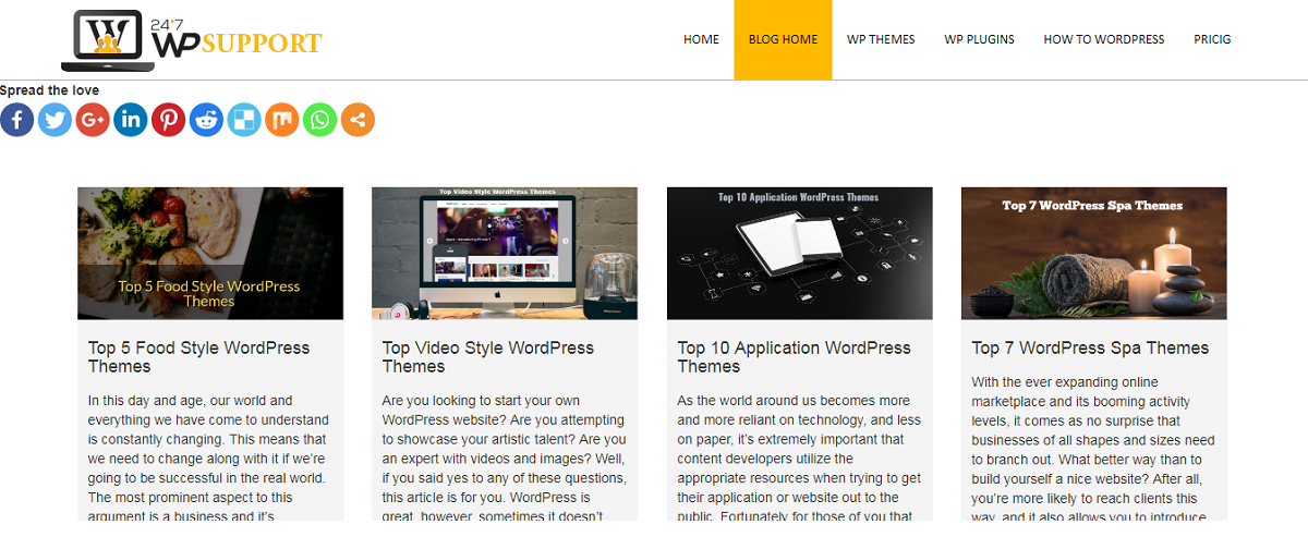
As you can see, the menu on this blog is placed near the top of the site, and encompasses all major topics. This allows any and all users to navigate the site easily and efficiently.
Menu placement is a common trait throughout the majority of WordPress themes. This means you won’t have to worry about changing themes while following this step by step guide. Now that we all understand the logic behind a navigation menu, let’s jump right into the action.
WordPress provides website creators with a unique CMS system that has been proven to be reliable and very easy to use across all IT fields. To reduce confusion, each WordPress theme is actually designed to incorporate this system. Every theme should have multiple menu locations that a creator can manage. Simple portfolio sites to online businesses can all be accommodated through this system.
Navigation Menu Creation
To start off, go to your WordPress administration area. If you’re uncertain how to do this, all you have to do is type in your website link and add “/wp-admin”. Your administration panel should look like the following screenshot.
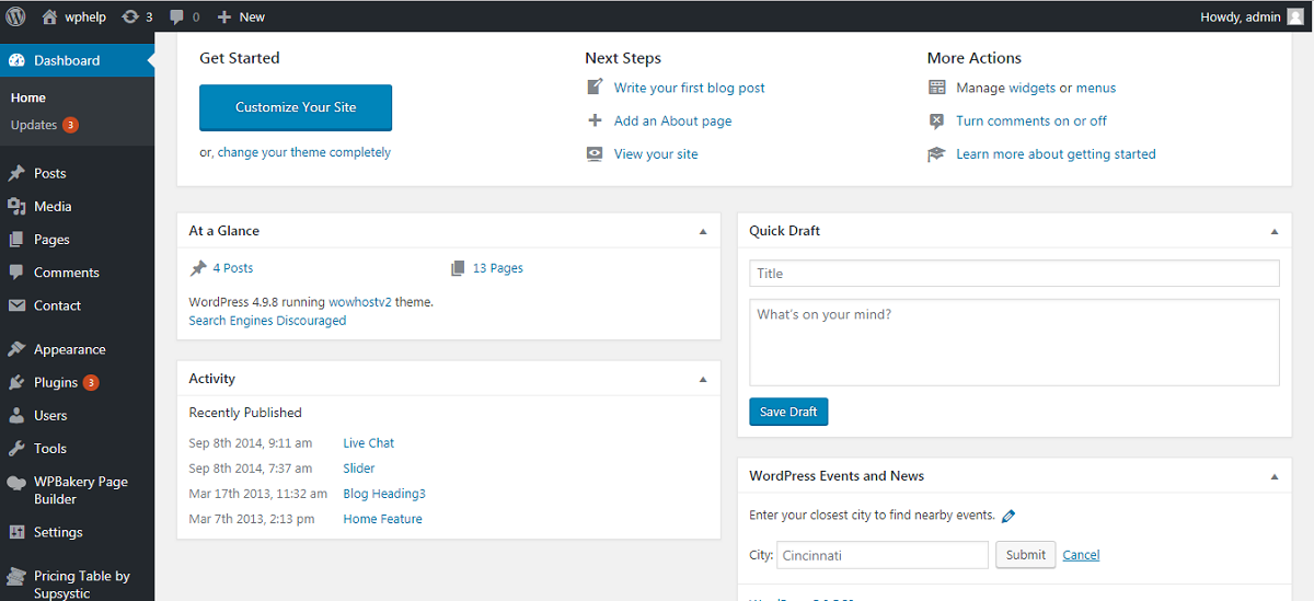
Your next step is to go to your “appearance” settings. Once you’ve opened up this menu, click “menu”. You should be directed to your menu editing page, which has been divided into two portions. On the left, you should see your pages. On the right you should see the item menus you can edit and adjust.
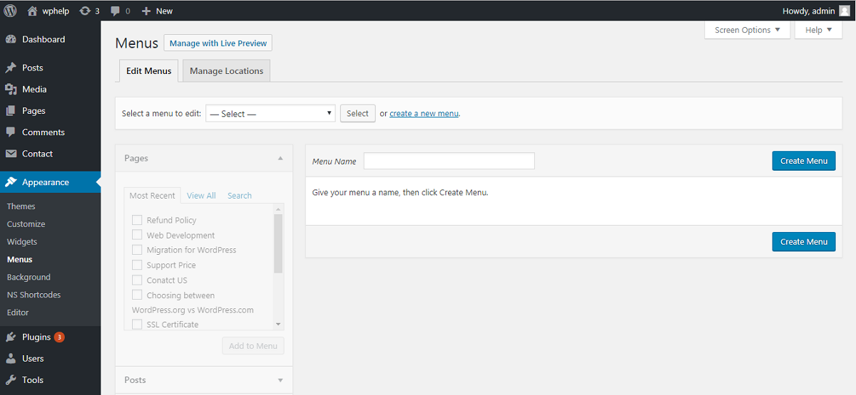
It’s time to create your first custom navigation menu.
To start off, provide a name for your menu. It can be anything, but make sure it accurately describes what the menu incorporates because you can have several menus across the site. If you mix them up, they’ll become difficult to manage. Once you’ve decided on a name, click on the menu creation button. The menu area will expand and look like the following.
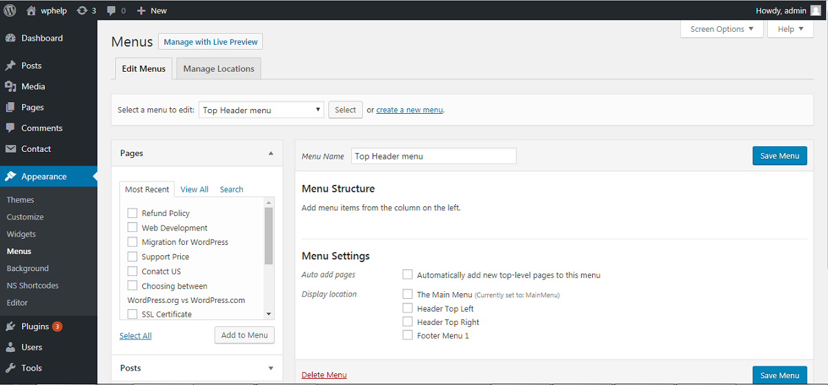
As displayed within the screenshot, the example site has three theme locations. “Top Menu”, “Primary Menu”, and “Footer Menu”. Of course, differing themes will have different names and placements.
Your next step is to add the pages you want to your new menu. On the left hand side of the newly expanded menu screen, you should be able to check off your choices. Once you’ve chosen everything, click “Add to Menu”.
Once you’ve chosen all your pages and added them to your menu, you’ll need to choose which theme location your menu is going to be displayed on. Once you’ve decided, click “Save Menu”.
Your menu will show up in the selected location on your site. If you’re unsure of where this is, feel free to browse around the site until you find it. If you dislike the location, you can always change it by going back and selecting a different theme location.
It’s important to note that if you have three theme locations for a menu, you can actually have three different menus. They can all be created by repeating the previous steps.
Your menu should be in the order that you added them. If this isn’t preferential, you can rearrange them by drag and dropping the items where you want them to be.
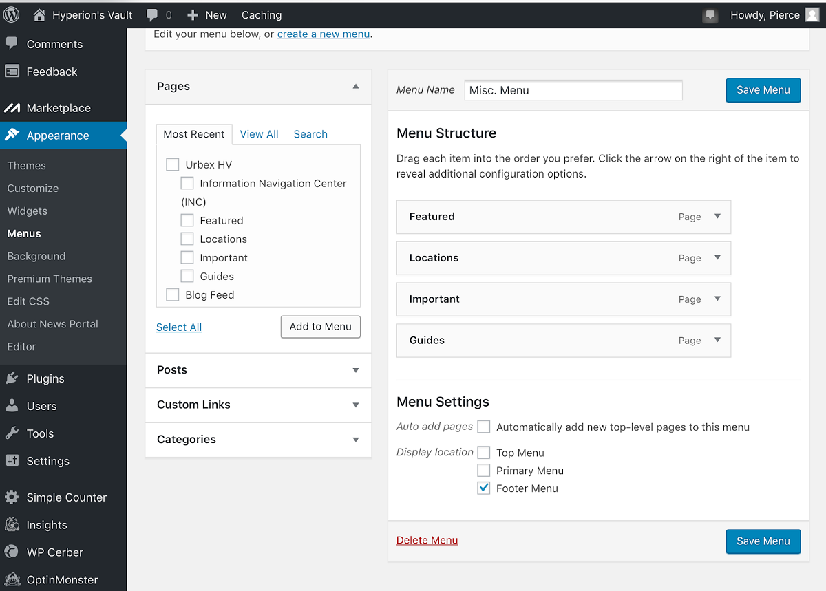
These types of menus are those that utilize parent and child items. You can have multiple drop downs, as you can have multiple parent items. The way this works is that pages are set to parent as default. You can manually set a page to child by providing it with a parent page. Each parent can have multiple child pages.

These menus provide an organizational element to your menus. All your users have to do is hover over the parent item, and they’ll see various child pages that they can click on. A parent item will typically have an arrow pointed down beside their text.
In order to create a drop down menu, you have to establish which item is a parent and which is a child, which is a common theme through the IT field. Thankfully, the current items are all parent items according to their default setting. This makes everything a whole lot easier. In order to create a child item, just drag and drop the child page under the parent page you want it to fall under. Once you’ve dropped it under, drag it slightly to the right in order to establish it as a child item.
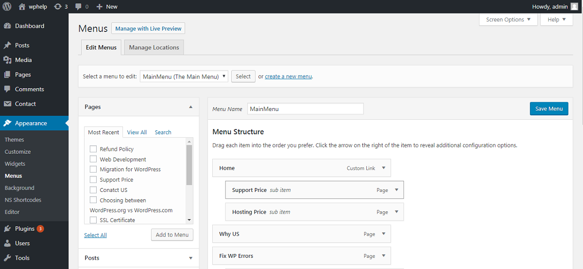
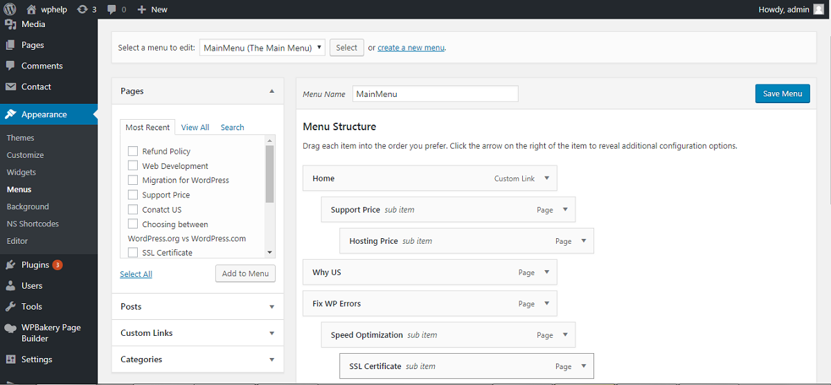
You can even add sub parents. This means turning a child item into a sub parent by dragging another item under one of your child items, and then moving it slightly to the right.
In order to display your various categories under your custom menus, expand the “Categories” tab. All you have to do is select the categories you want and add them to the menu the same way you did with your pages in the previous steps.
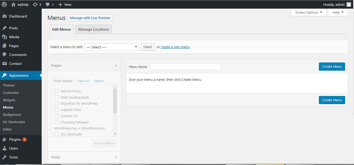
Category items act the same way as regular menu items. You can rearrange them and create parent and child items the same way as you did with your pages.
If you want to add a custom link to one of your posts, or even to a social media page, all you have to do is expand the “Custom Links” tab.
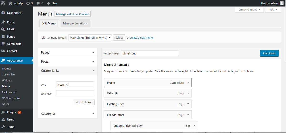
Type in the link you wish to use, and provide the link’s text. The text is what will be displayed in the menu. When inserting the link, ensure that you use http:// or something similar, otherwise the link will be broken.
This text element acts the same way as your categories and pages that have already been added to the menus.
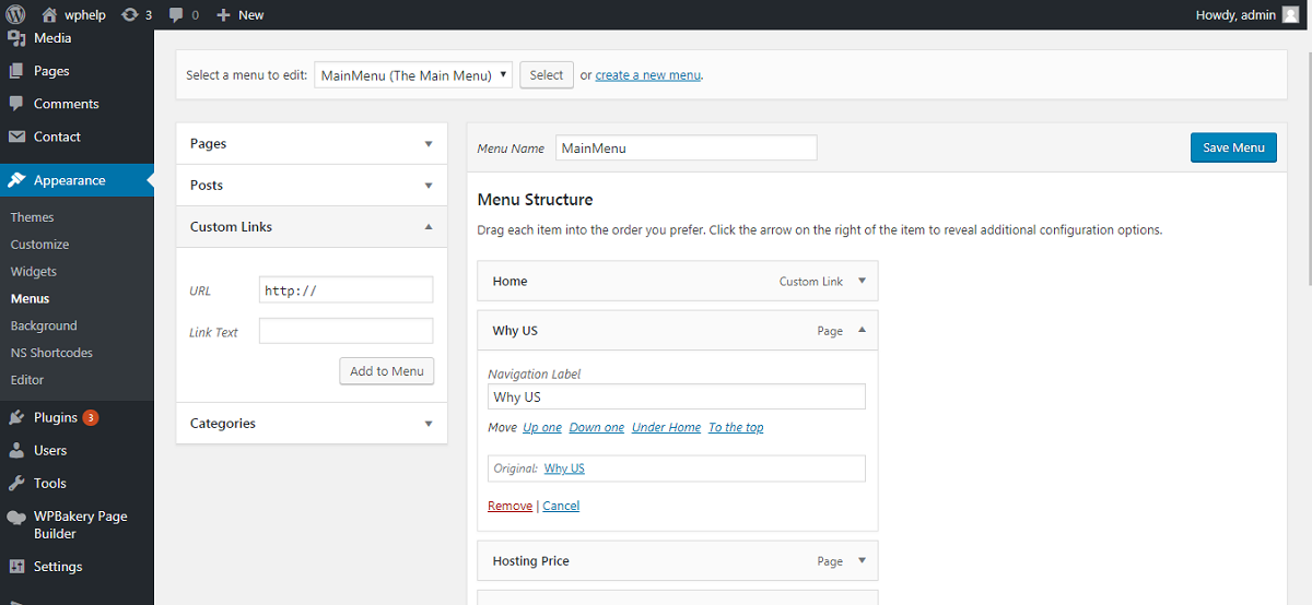
In regards to editing or removing items from a menu, all you have to do is click the down arrow displayed beside the item. It doesn’t matter what label it holds (Ex. Parent, Child, Etc.).
Once you’ve expanded this menu, you can edit the item’s name and attribute if you so choose.
“Navigation Label” simply means how people see it in your menu. Your original name is also saved so don’t worry about wanting to change back and unfortunately forgetting the original name.
Putting aside the location, theme menus, you can also display a navigation menu under a widget. This is a significant feature because it allows you to place a navigation menu in virtually anywhere.
In order to add the custom menu widget, all you have to do is go to “Appearance”. Next, click on “Widgets”.
Move “Custom Menu” to one of your sidebar widgets. Next, put a title on the widget and select a custom menu. Your final step for this task is to click “Save”. All done!
Unlike typical drop down menus, a mega menu is one that allows for multiple columns of drop down items. You can even add images and video into this menu.
Who Should Add a Mega Menu?
A mega menu is especially helpful for people who have a lot of content. An example would be an online business. Perhaps they have to sell dozens of products, all different in nature. Perhaps they all don’t fall under the same category, in fact, it make take twenty six categories! If this is the case, a mega menu is required.
Getting Started
First order of business. You need to install WordPress’ “Max Mega Menu” plugin. It’s free and rated as one of the best Mega Menu plugins. All you need to do to install the plugin is visit “Plugins” under your admin panel. Next, find “Add New”. Next, search up the plugin, and download and install it. It should automatically activate. If it doesn’t, visit your installed plugins page and activate it manually by selecting “Activate”.
Once you’ve installed and activated the plugin, it will show up on your admin menu. The sidebar to the left. You may need to scroll down.
Click this option, and it’ll take you to your Mega Menu settings. The settings should already be set up in order to operate on your website, however, you’ll need to change the colour scheme in order to match your website.
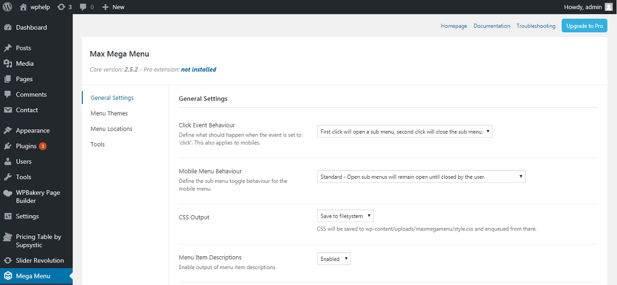
Once you’ve configured your mega menu colour settings, visit “Appearance” under your admin menu, and select “Menu”.
Your next step is to enable your mega menu by selecting “Enable”. You will see a Mega Menu button on a menu tab. By clicking this button, a pop up will be displayed. Add any widget you want to your mega menu.
If you’d like to edit a widget before placing it on your mega menu hit the wrench button beside the widget being currently displayed.
Don’t forget to save your work by clicking “Save”. Once you’ve saved, you can visit your website to view your brand new Mega Menu.
Make sure you update the plugin when updates are available for bug fixes and perhaps even some fun new updates.
This method is easy and requires no coding. There is always a coding option for responsive mobile menus, but for now we’ll be covering the non coding method.
The menu we will be creating today is called a hamburger menu. This means it slides out from either the left or right on a mobile screen.
Getting Started
Your first step on the road to creating a responsive mobile menu is going to be to install the “Responsive Menu” plugin. To do this, follow the same steps covered under the “Mega Menu” guide we covered previously.
Once the plugin is activated, it will be listed under your admin menu as “Responsive Menu”. Click it to expand its settings page.
Your going to need to ensure the screen width is set correctly. The default should be 800 pixels, or “px” for short. This default value should fit most websites.
Once you’ve set the width correctly, select the menu you’d like to act as a responsive menu. If you don’t have a configured menu just yet, visit the top of this article to get started.
Click on the “Update Options” button in order to save your settings. Once this is completed, your responsive menu is ready to go.
You can explore various customizations in the plugins settings page.
This method is easy and requires no coding. There is always a coding option for responsive drop down mobile menus, but for now we’ll be covering the non coding method.
Getting Started
Your first step is to install the “Responsive Select Menu” plugin. If you’re unsure how to do so, check out the instructions under the “Mega Menu” plugin.
Once the plugin is activated, go to your “Appearance” tab under your admin panel. Next, select “Responsive Select” in order to configure the settings that go along with the plugin.
Your first and only necessary task before updating width is to activate your theme locations by clicking “Activate All Theme Locations”. You can also selectively activate theme locations for more control over your menus.
Click “Save” to save all of your changes. Once everything is prepped, visit your site in order to establish whether or not your menu’s pixels need to be altered to fit the site.
Your mobile drop down menu has been completed.
To put it in simple terms, sticky menus are menus that you always see. Usually, regular menus float off the screen as the viewer scrolls down, whether the menu be a sidebar or a header menu. Follow the below steps to easily implement a sticky menu into your site.
Installing the Plugin
Your first step is to install the Sticky Menu plugin called “Sticky Menu (or Anything!) on Scroll”. If you’re unsure in regards to how to do this, check out the instructions under “Mega Menu”.
Configuration
Once everything is installed and activated and you have your menus setup, you’ll need to click on your Sticky Menu plugin which can be found under your admin menu.
Once on the settings page, you’ll need to enter the CSS ID of the nav menu you want to label as sticky. To do this, use your browser’s inspection tool.
As an example, if my navigation menu is labeled “sticky-navigation”, I need to find that phrase. You can then enter into the plugin’s CSS settings “#sticky-navigation”.
Your next steps are to set up pixel dimensions, which is fairly well explained within the plugin. Make sure to click “Check for Admin Bar” in order to save space when logged in.
You can also explore the mobile settings for this plugin. They’ll allow the menu to be unsticked when a mobile device is being used to browse your webpage.
Make sure you click “Save” when ready.
Your sticky menu is now ready for use. Check it out!
WordPress menu_add_page
To put it simplistically, the add_menu_page and the add_submenu_page functions are utilized in order to implement menu and submenu elements to your WordPress dashboard. WordPress in itself has detailed analysis pages for this very snippet.
WordPress wp_nav_menu
Allows you to add custom navigation menus into WordPress themes. WordPress in itself has detailed analysis pages for this very snippet.
Menu icons are little images that appear beside every item amongst your custom menus. Setting up these icons is easy and you don’t need to use a plugin.
Step 1: Upload all of your images to your media section (all your icons). Do this by going to your administrative panel, and selecting “Media”. Next, click “Add New”.
It is recommended that you keep a third party copy of all the images URLs in order to keep them organized and to easily recognize what is what.
Step 2: Go back to your administrative panel, click on “Appearance”. Next, click on “Menus”. In this newly expanded screen, select the checkbox “Display CSS Classes in Menu Items” for the menus you want to add icons to.
Step 3: Click on any item within the menu that you want to add an icon onto. Enter a name into “CSS Classes”. This has to be the same name you enter into a CSS program in the next few steps.
Step 4: You’re going to need to go to your administrative panel, and click on “Appearance”. Once the appearance menu opens up, click on “Editor”. When this opens, find the style sheet, the theme’s CSS file. All design components should be mentioned here.
In this file, you’ll need to copy and paste the following code.
.homepage {
background-image: url(‘http://www.example.com/wp-content/uploads/2014/12/home.png’);
background-repeat: no-repeat;
background-position: left;
padding-left: 5px;
}
You are going to have to copy and paste this in seven times, making changes each time as well.
Every time you paste this into the file, you’ll need to change “homepage” to your previously typed in “CSS Classes” in step 3. You’ll also have to replace the URL with the URL corresponding to the item that you kept in a third party notepad or other application.
Congratulations, your icons have been successfully implemented.
The default option for opening menu items is to use the tab that’s already open. But what if you need both tabs for whatever task you may be completing? Here’s how.
Step 1: Go to your administrative panel, click “Appearance”, then click “Menu”. Next, click “Screen Options”.
Step 2: On the “Screen Options” page, check of “Link Target”. Close this settings page.
Step 3: Once again expand the menu options for an item by clicking the small downwards facing arrow. Enable “Open link in a new tab” option. Click “Save Menu”
Your menu item will now open up in a new tab.
WordPress Menu Shortcode
WordPress itself has put together some wonderful in depth tutorials to show the benefits behind their menu shortcodes. Some of those benefits being the ability to give a menu id and even a class.
All in all, WordPress provides and in-depth menu configuration system with virtually limitless possibilities. Whether you want a drop down menu on mobile or a Mega Menu full of social media links, WordPress has got you covered.
Hopefully this step by step guide has helped you accomplish your goals, and of course as always, feel free to leave any questions or concerns within our comments section.
Disclaimer: All screenshots are from example blogs located across the web and we do not own the rights to them. For further questions, leave us a comment. wordpress Menu plugins

Brian is a WordPress support specialist and content contributor at 24×7 WP Support. He writes practical, easy-to-follow guides on WordPress troubleshooting, WooCommerce issues, plugin and theme errors, website security, migrations, performance optimization, and integrations. With a focus on solving real website problems, Brian helps business owners, bloggers, and online store managers keep their WordPress sites running smoothly.


